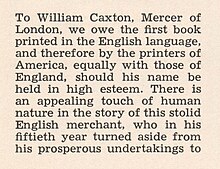
The Legibility Group is a series of serif typefaces created by the American Mergenthaler Linotype Company and intended for use in newspapers on Linotype's hot metal typesetting system. They were developed in-house by Linotype's design team, led by Chauncey H. Griffith, and released from 1925, when the first member, Ionic No. 5, appeared.
Griffith's aim with the Legibility Group typefaces was to create a design with more body than the rather spindly Didone typefaces previously standard in newspaper printing. To this end, the designs have low contrast in stroke weight, wide open counters and ball terminals, intended to make the letters clearly distinguishable even when printed on poor-quality newsprint paper.
The Legibility Group typefaces were extremely popular and remained used by many newspapers worldwide throughout the metal type period and beyond; many other newspaper typefaces from other foundries such as Intertype were created based on their design. A notable exception is Monotype's Times New Roman, which was created to take advantage of the unusually high standard of printing of the Times in the 1930s. In 1972, British printing manager Allen Hutt commented that "the majority of the world's newspapers are typeset in one or another of the traditional Linotype 'Legibility Group', and most of the rest in their derivatives."
Typefaces
The family became a large group due to the creation of slightly different designs for different printing conditions, such as levels of inking used in different newspaper production processes and versions with different x-heights. Linotype carried out a survey of optometrists as part of their research process.
- Ionic No. 5 — the first in the family and extremely successful. Sometimes criticised for having too high an x-height, making lower-case letters very wide and reducing the difference between an "n" and an "h". Bitstream Inc.'s News 701 typeface is an unofficial digitisation.
- Textype — similar but with a lower x-height, giving a more delicate structure with more contrast between letters with and without ascenders.
- Excelsior — reduced x-height and intended for rubber-roller presses. Linotype has described its use as most common "in Europe, where newspaper columns are wide."
- Opticon — heavier, to compensate for printing that deliberately underinks to favour halftones.
- Paragon — lighter, to compensate for newspapers that deliberately overink to favour text and headlines.
- Corona — condensed and large on the body. Walter Tracy praised it for carrying "the design of newspaper types to a new level."
Although not part of the family, Linotype marketed its sans-serif family Metro and slab serif face Memphis as effective complements for headings.
Design style


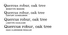
The Legibility Group faces resemble the "modern" or Didone faces of the nineteenth century, with ball terminals, a curled leg on the "R" and a looped "Q". However, stroke contrast is limited and the apertures are held wide open to clearly differentiate letters.
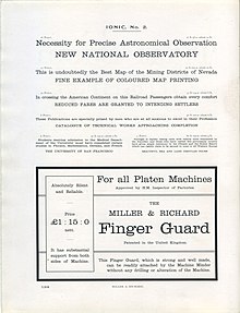
As the name "Ionic No. 5" suggests, the "legibility group" typefaces resembled slab serif typefaces of the nineteenth century, variously called "Clarendon" or "Ionic", but it is modified from these to have a build suitable for body text. Hutt suggests that the design was based on the popular family of the name Ionic from Miller & Richard and copies from other foundries, slightly bolder than was considered normal for body text during the late nineteenth century. G. Willem Ovink, however, has argued that a more direct influence (although not on the italic) was American Type Founders' Century Expanded, also a Didone face with reduced contrast, but that Linotype were unwilling to admit any influence from a competitor's work and so chose a name suggesting a more distant inspiration.
Notes
- Times New Roman's bold weight, however, is more similar to the Legibility Group style.
- A modern method similar to this is font grades, different designs of digital font intended to compensate for different amounts of ink spread.
- Not to be confused with the script typeface Coronet.
- The Modern face would not have seemed so high in contrast in print at small sizes. (For specimen images of these faces in metal type, see Hutt.)
References
- ^ Hutt, Allen (1973). The Changing Newspaper: typographic trends in Britain and America 1622-1972 (1. publ. ed.). London: Fraser. pp. 100–2 etc. ISBN 9780900406225.
- Victor Margolin (2015). World History of Design. Bloomsbury Academic. pp. 445–6. ISBN 978-1-4725-6651-5.
- Alexander S. Lawson (January 1990). Anatomy of a Typeface. David R. Godine Publisher. pp. 277–294. ISBN 978-0-87923-333-4.
- Rotary International (January 1940). "The Rotarian". The Rotarian. Rotary International: 35–8. ISSN 0035-838X.
- ^ Tracy, Walter. Letters of Credit. pp. 82, 194–195.
- Arnold, Edmund C. Functional Newspaper Design. pp. 23–9.
- Butterick, Matthew. "Equity: specimen & manual" (PDF). MBType. Retrieved 7 August 2015.
- The Linotype Bulletin, Volume 19, Issues 1-2. 1929. pp. 10, 29.
- Gaultney, Victor. "Balancing typeface legibility and economy Practical techniques for the type designer". University of Reading (MA thesis). Retrieved 13 October 2017.
- Linotype. "Excelsior". MyFonts. Retrieved 23 May 2015.
- Schwemer-Scheddin, Yvonne. "Reputations: Adrian Frutiger". Eye. Retrieved 12 September 2015.
- ^ The Legibility of Type. Brooklyn: Mergenthaler Linotype Company. 1935. Retrieved 29 April 2016.
- Linotype Corona. Mergenthaler Linotype Company. c. 1951. Retrieved 1 August 2017.
- Frere-Jones, Tobias. "Decompiled and Remixed History". Frere-Jones Type. Retrieved 13 October 2017.
- Hutt, Allen (1971). Newspaper Design (2. ed., reprinted. ed.). London : Oxford University Press. pp. 54–8. ISBN 0192129368.
- Unger, Gerard (1 January 1981). "Experimental No. 223, a newspaper typeface, designed by W.A. Dwiggins". Quaerendo. 11 (4): 302–324. doi:10.1163/157006981X00274.
Bibliography
- Miklavčič, Mitja (2006). Three chapters in the development of clarendon /ionic typefaces (PDF) (Thesis). University of Reading. Archived from the original (PDF) on November 25, 2011. Retrieved 6 October 2014.
- Consuegra, David. American Type Design & Designers. Allworth Communications, Inc.: 2004. ISBN 1-58115-320-1, ISBN 978-1-58115-320-0
- Hutt, Allen. Changing Newspaper: Typographic Trends in Britain and America 1622–1972. Gordon Fraser.: 1973. ISBN 0-900406-22-4, ISBN 978-0-900406-22-5
- Macmillan, Neil. An A-Z of Type Designers. Yale University Press.: 2006. ISBN 0-300-11151-7, ISBN 978-0-300-11151-4
External links
- Excelsior Font Family — by Chauncey H. Griffith
- Font Designer — Chauncey H. Griffith
- Advertisement in the UK Daily Mirror promoting the changeover to using Ionic
- Linotype advertisement explaining the design's structure