| Revision as of 15:17, 22 February 2013 editAddbot (talk | contribs)Bots2,838,809 editsm Bot: Migrating 21 interwiki links, now provided by Wikidata on d:q373984 (Report Errors)← Previous edit | Revision as of 16:43, 22 February 2013 edit undoIncnis Mrsi (talk | contribs)Extended confirmed users, Pending changes reviewers, Rollbackers11,646 editsm - fr:Couleur secondaire et complémentaire — Wikidata already provides fr:Couleur secondaire, which is correctTag: Removal of all interwiki links; Wikidata is liveNext edit → | ||
| Line 39: | Line 39: | ||
| ] | ] | ||
| ] | ] | ||
| ] | |||
Revision as of 16:43, 22 February 2013
Complementary colors are pairs of colors that are of “opposite” hue in some color model. The exact hue “complementary” to a given hue depends on the model in question, and perceptually uniform, additive, and subtractive color models, for example, have differing complements for any given color.
Color theory

In color theory, two colors are called complementary if, when mixed in the proper proportion, they produce a neutral color (grey, white, or black).
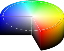
In roughly-perceptual color models, the neutral colors (white, greys, and black) lie along a central axis. For example, in the HSV color space, complementary colors (as defined in HSV) lie opposite each other on any horizontal cross-section.
Thus, in the CIE 1931 color space a color of a particular "dominant" wavelength can be mixed with a particular amount of the "complementary" wavelength to produce a neutral color (grey or white).
In the RGB color model (and derived models such as HSV), primary colors and secondary colors are paired in this way:
Afterimages
When one stares at a single color (red for example) for a sustained period of time (roughly thirty seconds to a minute), then looks at a white surface, an afterimage of the complementary color (in this case cyan) will appear. This is one of several aftereffects studied in the psychology of visual perception which are generally ascribed to fatigue in specific parts of the visual system.
In the case above the photoreceptors for red light in the retina are fatigued, lessening their ability to send the information to the brain. When white light is viewed, the red portions of light incident upon the eye are not transmitted as efficiently as the other wavelengths (or colors), and the result is the illusion of viewing the complementary color since the image is now biased by loss of the color, in this case red. As the receptors are given time to rest, the illusion vanishes. In the case of looking at white light, red light is still incident upon the eye (as well as blue and green), however since the receptors for other light colors are also being fatigued, the eye will reach an equilibrium.
Art and design
Because of the limitations imposed by the range of colors that were available throughout most of the history of art, many artists still use a traditional set of complementary pairs, including (as proposed by Goethe, cf. Goethe's color wheel):
The incorrect belief that the complementary to green is red exists in popular culture. For example, it is presented in books of Bride M. Whelan where he alleges it to be supported by RYB color model. Indeed, red, yellow and blue represent a traditional color scheme, not a kind of color theory. Furthermore, identity of traditional RYB's "red" with the modern understanding of this color term is not evident. Subsequent re-interpretations of old texts which used imprecise and mismatching definitions of "red", "blue" and "green" often increased the confusion.
When two complements of opaque paint are mixed, they approximate black. For example, a little bit of ultramarine mixed with orange, produces a dark variation of black. Placed side by side as tiny dots, in partitive color mixing, they produce gray. As colored light projected on a white screen, in additive color mixing, they produce white.
The use of complementary colors is an important aspect of aesthetically pleasing art and graphic design. This also extends to other fields such as contrasting colors in logos and retail display. When placed next to each other, complements make each other appear brighter. On an artistic color wheel, complementary colors are placed opposite one another. Although these artistic complements may not be precise complements under the scientific definition, most artistic color wheels are laid out roughly like the HSV color wheel discussed above.
References
- "Color & The Absorption Spectrum". Retrieved 2007-01-14.
- Goethe, Johann Wolfgang von (1810). "1. Abteilung. Physiologische Farben". Zur Farbenlehre (in German).
{{cite book}}:|access-date=requires|url=(help); External link in|chapterurl=|chapterurl=ignored (|chapter-url=suggested) (help); Unknown parameter|trans_title=ignored (|trans-title=suggested) (help) - David Briggs (2007). "The Dimensions of Color". Retrieved 2011-11-23.
| Color topics | ||||||||||
|---|---|---|---|---|---|---|---|---|---|---|
| Color science |
|  | ||||||||
| Color philosophy |
| |||||||||
| Color terms |
| |||||||||
| Color organizations | ||||||||||
| Names |
| |||||||||
| Related | ||||||||||