| This article needs additional citations for verification. Please help improve this article by adding citations to reliable sources. Unsourced material may be challenged and removed. Find sources: "Visualization" graphics – news · newspapers · books · scholar · JSTOR (February 2013) (Learn how and when to remove this message) |

Visualization (or visualisation (see spelling differences)), also known as Graphics Visualization, is any technique for creating images, diagrams, or animations to communicate a message. Visualization through visual imagery has been an effective way to communicate both abstract and concrete ideas since the dawn of humanity. from history include cave paintings, Egyptian hieroglyphs, Greek geometry, and Leonardo da Vinci's revolutionary methods of technical drawing for engineering purposes that actively involve scientific requirements.
Visualization today has ever-expanding applications in science, education, engineering (e.g., product visualization), interactive multimedia, medicine, etc. Typical of a visualization application is the field of computer graphics. The invention of computer graphics (and 3D computer graphics) may be the most important development in visualization since the invention of central perspective in the Renaissance period. The development of animation also helped advance visualization.
Overview


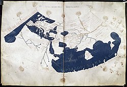
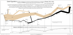
The use of visualization to present information is not a new phenomenon. It has been used in maps, scientific drawings, and data plots for over a thousand years. Examples from cartography include Ptolemy's Geographia (2nd century AD), a map of China (1137 AD), and Minard's map (1861) of Napoleon's invasion of Russia a century and a half ago. Most of the concepts learned in devising these images carry over in a straightforward manner to computer visualization. Edward Tufte has written three critically acclaimed books that explain many of these principles.
Computer graphics has from its beginning been used to study scientific problems. However, in its early days the lack of graphics power often limited its usefulness. The recent emphasis on visualization started in 1987 with the publication of Visualization in Scientific Computing, a special issue of Computer Graphics. Since then, there have been several conferences and workshops, co-sponsored by the IEEE Computer Society and ACM SIGGRAPH, devoted to the general topic, and special areas in the field, for example volume visualization.
Most people are familiar with the digital animations produced to present meteorological data during weather reports on television, though few can distinguish between those models of reality and the satellite photos that are also shown on such programs. TV also offers scientific visualizations when it shows computer drawn and animated reconstructions of road or airplane accidents. Some of the most popular examples of scientific visualizations are computer-generated images that show real spacecraft in action, out in the void far beyond Earth, or on other planets. Dynamic forms of visualization, such as educational animation or timelines, have the potential to enhance learning about systems that change over time.
Apart from the distinction between interactive visualizations and animation, the most useful categorization is probably between abstract and model-based scientific visualizations. The abstract visualizations show completely conceptual constructs in 2D or 3D. These generated shapes are completely arbitrary. The model-based visualizations either place overlays of data on real or digitally constructed images of reality or make a digital construction of a real object directly from the scientific data.
Scientific visualization is usually done with specialized software, though there are a few exceptions, noted below. Some of these specialized programs have been released as open source software, having very often its origins in universities, within an academic environment where sharing software tools and giving access to the source code is common. There are also many proprietary software packages of scientific visualization tools.
Models and frameworks for building visualizations include the data flow models popularized by systems such as AVS, IRIS Explorer, and VTK toolkit, and data state models in spreadsheet systems such as the Spreadsheet for Visualization and Spreadsheet for Images.
Applications
Scientific visualization

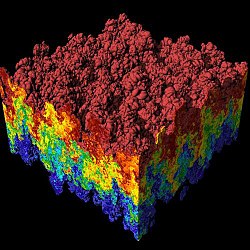
As a subject in computer science, scientific visualization is the use of interactive, sensory representations, typically visual, of abstract data to reinforce cognition, hypothesis building, and reasoning. Scientific visualization is the transformation, selection, or representation of data from simulations or experiments, with an implicit or explicit geometric structure, to allow the exploration, analysis, and understanding of the data. Scientific visualization focuses and emphasizes the representation of higher order data using primarily graphics and animation techniques. It is a very important part of visualization and maybe the first one, as the visualization of experiments and phenomena is as old as science itself. Traditional areas of scientific visualization are flow visualization, medical visualization, astrophysical visualization, and chemical visualization. There are several different techniques to visualize scientific data, with isosurface reconstruction and direct volume rendering being the more common.
Data and information visualization
Main article: Data and information visualization Further information: Infographics
Data visualization is a related subcategory of visualization dealing with statistical graphics and geospatial data (as in thematic cartography) that is abstracted in schematic form.
Information visualization concentrates on the use of computer-supported tools to explore large amount of abstract data. The term "information visualization" was originally coined by the User Interface Research Group at Xerox PARC and included Jock Mackinlay. Practical application of information visualization in computer programs involves selecting, transforming, and representing abstract data in a form that facilitates human interaction for exploration and understanding. Important aspects of information visualization are dynamics of visual representation and the interactivity. Strong techniques enable the user to modify the visualization in real-time, thus affording unparalleled perception of patterns and structural relations in the abstract data in question.
Educational visualization
Educational visualization is using a simulation to create an image of something so it can be taught about. This is very useful when teaching about a topic that is difficult to otherwise see, for example, atomic structure, because atoms are far too small to be studied easily without expensive and difficult to use scientific equipment.
Knowledge visualization
The use of visual representations to transfer knowledge between at least two persons aims to improve the transfer of knowledge by using computer and non-computer-based visualization methods complementarily. Thus properly designed visualization is an important part of not only data analysis but knowledge transfer process, too. Knowledge transfer may be significantly improved using hybrid designs as it enhances information density but may decrease clarity as well. For example, visualization of a 3D scalar field may be implemented using iso-surfaces for field distribution and textures for the gradient of the field. Examples of such visual formats are sketches, diagrams, images, objects, interactive visualizations, information visualization applications, and imaginary visualizations as in stories. While information visualization concentrates on the use of computer-supported tools to derive new insights, knowledge visualization focuses on transferring insights and creating new knowledge in groups. Beyond the mere transfer of facts, knowledge visualization aims to further transfer insights, experiences, attitudes, values, expectations, perspectives, opinions, and predictions by using various complementary visualizations. See also: picture dictionary, visual dictionary
Product visualization
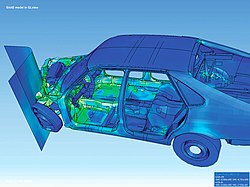
Product visualization involves visualization software technology for the viewing and manipulation of 3D models, technical drawing and other related documentation of manufactured components and large assemblies of products. It is a key part of product lifecycle management. Product visualization software typically provides high levels of photorealism so that a product can be viewed before it is actually manufactured. This supports functions ranging from design and styling to sales and marketing. Technical visualization is an important aspect of product development. Originally technical drawings were made by hand, but with the rise of advanced computer graphics the drawing board has been replaced by computer-aided design (CAD). CAD-drawings and models have several advantages over hand-made drawings such as the possibility of 3-D modeling, rapid prototyping, and simulation. 3D product visualization promises more interactive experiences for online shoppers, but also challenges retailers to overcome hurdles in the production of 3D content, as large-scale 3D content production can be extremely costly and time-consuming.
Visual communication
Visual communication is the communication of ideas through the visual display of information. Primarily associated with two dimensional images, it includes: alphanumerics, art, signs, and electronic resources. Recent research in the field has focused on web design and graphically oriented usability.
Visual analytics
Visual analytics focuses on human interaction with visualization systems as part of a larger process of data analysis. Visual analytics has been defined as "the science of analytical reasoning supported by the interactive visual interface".
Its focus is on human information discourse (interaction) within massive, dynamically changing information spaces. Visual analytics research concentrates on support for perceptual and cognitive operations that enable users to detect the expected and discover the unexpected in complex information spaces.
Technologies resulting from visual analytics find their application in almost all fields, but are being driven by critical needs (and funding) in biology and national security.
Interactivity
See also: Interactive data visualization and Interactive whiteboardInteractive visualization or interactive visualisation is a branch of graphic visualization in computer science that involves studying how humans interact with computers to create graphic illustrations of information and how this process can be made more efficient.
For a visualization to be considered interactive it must satisfy two criteria:
- Human input: control of some aspect of the visual representation of information, or of the information being represented, must be available to a human, and
- Response time: changes made by the human must be incorporated into the visualization in a timely manner. In general, interactive visualization is considered a soft real-time task.
One particular type of interactive visualization is virtual reality (VR), where the visual representation of information is presented using an immersive display device such as a stereo projector (see stereoscopy). VR is also characterized by the use of a spatial metaphor, where some aspect of the information is represented in three dimensions so that humans can explore the information as if it were present (where instead it was remote), sized appropriately (where instead it was on a much smaller or larger scale than humans can sense directly), or had shape (where instead it might be completely abstract).
Another type of interactive visualization is collaborative visualization, in which multiple people interact with the same computer visualization to communicate their ideas to each other or to explore information cooperatively. Frequently, collaborative visualization is used when people are physically separated. Using several networked computers, the same visualization can be presented to each person simultaneously. The people then make annotations to the visualization as well as communicate via audio (i.e., telephone), video (i.e., a video-conference), or text (i.e., IRC) messages.
Human control of visualization
The Programmer's Hierarchical Interactive Graphics System (PHIGS) was one of the first programmatic efforts at interactive visualization and provided an enumeration of the types of input humans provide. People can:
- Pick some part of an existing visual representation;
- Locate a point of interest (which may not have an existing representation);
- Stroke a path;
- Choose an option from a list of options;
- Valuate by inputting a number; and
- Write by inputting text.
All of these actions require a physical device. Input devices range from the common – keyboards, mice, graphics tablets, trackballs, and touchpads – to the esoteric – wired gloves, boom arms, and even omnidirectional treadmills.
These input actions can be used to control both the unique information being represented or the way that the information is presented. When the information being presented is altered, the visualization is usually part of a feedback loop. For example, consider an aircraft avionics system where the pilot inputs roll, pitch, and yaw and the visualization system provides a rendering of the aircraft's new attitude. Another example would be a scientist who changes a simulation while it is running in response to a visualization of its current progress. This is called computational steering.
More frequently, the representation of the information is changed rather than the information itself.
Rapid response to human input
Experiments have shown that a delay of more than 20 ms between when input is provided and a visual representation is updated is noticeable by most people . Thus it is desirable for an interactive visualization to provide a rendering based on human input within this time frame. However, when large amounts of data must be processed to create a visualization, this becomes hard or even impossible with current technology. Thus the term "interactive visualization" is usually applied to systems that provide feedback to users within several seconds of input. The term interactive framerate is often used to measure how interactive a visualization is. Framerates measure the frequency with which an image (a frame) can be generated by a visualization system. A framerate of 50 frames per second (frame/s) is considered good while 0.1 frame/s would be considered poor. The use of framerates to characterize interactivity is slightly misleading however, since framerate is a measure of bandwidth while humans are more sensitive to latency. Specifically, it is possible to achieve a good framerate of 50 frame/s but if the images generated refer to changes to the visualization that a person made more than 1 second ago, it will not feel interactive to a person.
The rapid response time required for interactive visualization is a difficult constraint to meet and there are several approaches that have been explored to provide people with rapid visual feedback based on their input. Some include
- Parallel rendering – where more than one computer or video card is used simultaneously to render an image. Multiple frames can be rendered at the same time by different computers and the results transferred over the network for display on a single monitor. This requires each computer to hold a copy of all the information to be rendered and increases bandwidth, but also increases latency. Also, each computer can render a different region of a single frame and send the results over a network for display. This again requires each computer to hold all of the data and can lead to a load imbalance when one computer is responsible for rendering a region of the screen with more information than other computers. Finally, each computer can render an entire frame containing a subset of the information. The resulting images plus the associated depth buffer can then be sent across the network and merged with the images from other computers. The result is a single frame containing all the information to be rendered, even though no single computer's memory held all of the information. This is called parallel depth compositing and is used when large amounts of information must be rendered interactively.
- Progressive rendering – where a framerate is guaranteed by rendering some subset of the information to be presented and providing incremental (progressive) improvements to the rendering once the visualization is no longer changing.
- Level-of-detail (LOD) rendering – where simplified representations of information are rendered to achieve a desired framerate while a person is providing input and then the full representation is used to generate a still image once the person is through manipulating the visualization. One common variant of LOD rendering is subsampling. When the information being represented is stored in a topologically rectangular array (as is common with digital photos, MRI scans, and finite difference simulations), a lower resolution version can easily be generated by skipping n points for each 1 point rendered. Subsampling can also be used to accelerate rendering techniques such as volume visualization that require more than twice the computations for an image twice the size. By rendering a smaller image and then scaling the image to fill the requested screen space, much less time is required to render the same data.
- Frameless rendering – where the visualization is no longer presented as a time series of images, but as a single image where different regions are updated over time.
See also
References
| This article needs additional citations for verification. Please help improve this article by adding citations to reliable sources. Unsourced material may be challenged and removed. Find sources: "Visualization" graphics – news · newspapers · books · scholar · JSTOR (January 2008) (Learn how and when to remove this message) |
- Tufte, Edward R. (1990). Envisioning Information. ISBN 0961392118.
- Tufte, Edward R. (2001) . The Visual Display of Quantitative Information (2nd ed.). ISBN 0961392142.
- Tufte, Edward R. (1997). Visual Explanations: Images and Quantities, Evidence and Narrative. Graphics Press. ISBN 0961392126.
- "evl – electronic visualization laboratory". www.evl.uic.edu. Retrieved 2 September 2018.
- "Scientific Visualization." sciencedaily.com. Science Daily, 2010. Retrieved from web https://www.sciencedaily.com/articles/s/scientific_visualization.htm. on 17 November 2011.
- "Scientific Visualization." Scientific Computing and Imaging Institute. Scientific Computing and Imaging Institute, University of Utah, n.d. Retrieved from web http://www.sci.utah.edu/research/visualization.html. on 17 November 2011.
- Michael Friendly (2008). "Milestones in the history of thematic cartography, statistical graphics, and data visualization". Project moved to http://datavis.ca/milestones/
- (Burkhard and Meier, 2004),
- Opiła, Janusz (1 April 2019). "Role of Visualization in a Knowledge Transfer Process". Business Systems Research Journal. 10 (1): 164–179. doi:10.2478/bsrj-2019-0012. ISSN 1847-9375.
- Opila, J.; Opila, G. (May 2018). "Visualization of computable scalar 3D field using cubic interpolation or kernel density estimation function". 2018 41st International Convention on Information and Communication Technology, Electronics and Microelectronics (MIPRO). Opatija: IEEE. pp. 0189–0194. doi:10.23919/MIPRO.2018.8400036. ISBN 9789532330953. S2CID 49640048.
- "3D Workflows in Global E-Commerce". www.dgg3d.com. 28 February 2020. Retrieved 22 April 2020.
- Thomas, J.J., and Cook, K.A. (Eds) (2005). An Illuminated Path: The Research and Development Agenda for Visual Analytics, IEEE Computer Society Press, ISBN 0-7695-2323-4
Further reading
- Battiti, Roberto; Mauro Brunato (2011). Reactive Business Intelligence. From Data to Models to Insight. Trento, Italy: Reactive Search Srl. ISBN 978-88-905795-0-9.
- Bederson, Benjamin B., and Ben Shneiderman. The Craft of Information Visualization: Readings and Reflections, Morgan Kaufmann, 2003, ISBN 1-55860-915-6.
- Cleveland, William S. (1993). Visualizing Data.
- Cleveland, William S. (1994). The Elements of Graphing Data.
- Charles D. Hansen, Chris Johnson. The Visualization Handbook, Academic Press (June 2004).
- Kravetz, Stephen A. and David Womble. ed. Introduction to Bioinformatics. Totowa, N.J. Humana Press, 2003.
- Mackinlay, Jock D. (1999). Readings in information visualization: using vision to think. Card, S. K., Ben Shneiderman (eds.). Morgan Kaufmann Publishers Inc. pp. 686. ISBN 1-55860-533-9.
- Will Schroeder, Ken Martin, Bill Lorensen. The Visualization Toolkit, by August 2004.
- Spence, Robert Information Visualization: Design for Interaction (2nd Edition), Prentice Hall, 2007, ISBN 0-13-206550-9.
- Edward R. Tufte (1992). The Visual Display of Quantitative Information
- Edward R. Tufte (1990). Envisioning Information.
- Edward R. Tufte (1997). Visual Explanations: Images and Quantities, Evidence and Narrative.
- Matthew Ward, Georges Grinstein, Daniel Keim. Interactive Data Visualization: Foundations, Techniques, and Applications. (May 2010).
- Wilkinson, Leland. The Grammar of Graphics, Springer ISBN 0-387-24544-8
External links
- National Institute of Standards and Technology
- Scientific Visualization Tutorials, Georgia Tech
- Scientific Visualization Studio (NASA)
- Visual-literacy.org, (e.g. Periodic Table of Visualization Methods)
- Conferences
Many conferences occur where interactive visualization academic papers are presented and published.
- Amer. Soc. of Information Science and Technology (ASIS&T SIGVIS) Special Interest Group in Visualization Information and Sound
- ACM SIGCHI
- ACM SIGGRAPH
- ACM VRST
- Eurographics
- IEEE Visualization
- ACM Transactions on Graphics
- IEEE Transactions on Visualization and Computer Graphics
| Computer science | |
|---|---|
| Note: This template roughly follows the 2012 ACM Computing Classification System. | |
| Hardware | |
| Computer systems organization | |
| Networks | |
| Software organization | |
| Software notations and tools | |
| Software development | |
| Theory of computation | |
| Algorithms | |
| Mathematics of computing | |
| Information systems |
|
| Security | |
| Human–computer interaction | |
| Concurrency | |
| Artificial intelligence | |
| Machine learning | |
| Graphics | |
| Applied computing |
|