| This article needs additional citations for verification. Please help improve this article by adding citations to reliable sources. Unsourced material may be challenged and removed. Find sources: "Radio button" – news · newspapers · books · scholar · JSTOR (November 2022) (Learn how and when to remove this message) |

A radio button or option button is a graphical control element that allows the user to choose only one of a predefined set of mutually exclusive options. The singular property of a radio button makes it distinct from checkboxes, where the user can select and unselect any number of items.
Radio buttons are arranged in groups of two or more and displayed on screen as, for example, a list of circular holes that can contain white space (for unselected) or a dot (for selected). Each radio button is normally accompanied by a label describing the choice that the radio button represents. The choices are mutually exclusive; when the user selects a radio button, any previously selected radio button in the same group becomes deselected (making it so only one can be selected). Selecting a radio button is done by clicking the mouse on (or touching the screen over) the button, or the caption, or by using a keyboard shortcut.
Etymology

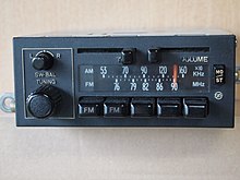
Radio buttons were named after the physical buttons used on older radios to select preset stations – when one of the buttons was pressed, other buttons would pop out, leaving the pressed button the only button in the "pushed in" position.
HTML
In web forms, the HTML element <input type="radio"> is used to display a radio button. Example:
<form>
    <input type="radio" name="season" value="winter" id="winter" checked>
    <label for="winter">Winter</label>
    <input type="radio" name="season" value="spring" id="spring">
    <label for="spring">Spring</label>
    <input type="radio" name="season" value="summer" id="summer">
    <label for="summer">Summer</label>
    <input type="radio" name="season" value="autumn" id="autumn">
    <label for="autumn">Autumn</label>
</form>
A group of attributes is defined by name. In one group, only one radio button can be chosen.
Unicode
Version 6 of the Unicode standard includes a character designated to represent a radio button, (🔘) at code point 128,280 (U+1F518), found in the Miscellaneous Symbols and Pictographs section. Similar characters are the mathematical operator U+2299 ⊙ CIRCLED DOT OPERATOR as well as U+25C9 ◉ FISHEYE and U+25CE ◎ BULLSEYE.
The font Wingdings 2 contains at position 153 and 158 glyphs that look like radio buttons.
See also
References
- ^ "Radio Buttons". Windows Dev Center. Retrieved 14 September 2016.
- Yumashev, Alex. "The history of a radio-button". JitBit Founders Blog. Retrieved 14 September 2016.
External links
- RFC 1866: the HTML 2.0 specification, which defined radio buttons on the web.
- W3 HTML 4.01 Specification
- Usage of radio buttons in Sun's Java Programming Tutorial
- Nielsen, Jakob (September 27, 2004). "Checkboxes vs. Radio Buttons". Nielsen Norman Group (article). . Retrieved November 12, 2014.
| Graphical control elements | |
|---|---|
| Command input | |
| Data input-output | |
| Informational | |
| Containers | |
| Navigational | |
| Special windows | |
| Related concepts | |