| This article is an orphan, as no other articles link to it. Please introduce links to this page from related articles; try the Find link tool for suggestions. (October 2019) |

A dashboard is a document presenting the most significant information about a subject on a single page. Microsoft SharePoint is a web application platform launched in 2001 as a centralized replacement for multiple web applications and supports various combinations of enterprise website requirements. A Microsoft SharePoint Dashboard is a feature of the Microsoft SharePoint platform that aggregates data from other systems and displays it in a browser-based location.
Key performance indicators

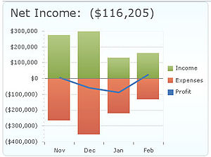
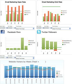
Key performance indicators (KPIs) are measurements of an organization's key success factors. KPIs are often established at the departmental level to achieve organizational goals. To be successfully implemented, KPIs should focus on metrics that are specific, measurable, and clearly communicated. SharePoint Dashboards are ideal for displaying the status of KPIs, because their quantifiable data can be pulled from multiple systems and provide a graphical summary of what is stored within the quantifiable data systems. SharePoint dashboards are not meant to replace the proprietary systems.
SharePoint Dashboard Data Sources

SharePoint Dashboards certainly aggregate data stored in any edition of Microsoft SharePoint. SharePoint 2010, SharePoint Foundation, WSS, and MOSS are examples of widely implemented SharePoint editions that graphically display data stored in SharePoint document libraries and lists. The data may be configured in a variety of views and chart types with standard and custom features.
Examples of other systems from which SharePoint dashboards can retrieve data include:
Customer relationship management systems
Customer relationship management (CRM) systems enable organizations to record and organize their interactions with customers, vendors, sales leads, and other contacts. Key contact information such as email address, phone number, and company website as well as communication history and notes are examples of information that is typically stored in a CRM system.
Commonly used CRM systems include Act!, GoldMine, Microsoft CRM, and Salesforce.
Enterprise resource planning and accounting systems
Enterprise resource planning (ERP) systems use integrated software applications to combine organizational information cross-functionally for use across the organization. Accounting systems are responsible for reporting an organization's financial information.
Examples of ERP and Accounting systems include Microsoft Dynamics, Oracle Financials, Peachtree Accounting, QuickBooks, and SAP.
Marketing and social media resources
An organization's marketing resources aim to identify, communicate with, and deliver value to its customers. Social media resources employ the use of web-based and mobile applications to promote the exchange of user-generated content.
Popular Marketing and Social Media applications include Facebook, Google Analytics, Internet Marketing, and Twitter.
Selecting a data aggregation method
There are many means of aggregating information to be displayed in a SharePoint Dashboard. Some common methods include Application Programming Interface (API), Business Connectivity Service/Business Data Catalogue, Microsoft Excel, and Open Database Connectivity (ODBC).
Comparing Dashboard Options

Automated aggregation
Excel
Many organisations use Microsoft Excel as a tool to collect data. This data is typically entered the spreadsheet manually.
SharePoint
Microsoft SharePoint can automatically gather data from a variety of systems and store the data in a central browser-based location. Any browser equipped device can then view the data.
Third-party tools
Third-party software components also offer automatic collection and display of data. Some tools are browser-enabled, but most require installation of software on a user's computer.
SQL Server Reporting Services (SSRS)
SQL Server Reporting Services provides user-friendly tools to format and report on data stored inside a SQL Server database.
Manual aggregation

Whiteboard
Many organizations choose to display their internal goal progress manually on a whiteboard. Posting it in a central location enables all team members to monitor progress. The manual method requires one or more members to continually update the whiteboard with timely data. This is a simple dashboard approach, but it often gets out-of-date quickly.
Paper graphics
Simply printing out dashboard graphics on paper and displaying them in a central location can have a positive effect on internal goals. The process of manually creating and posting paper dashboards, however, can become cumbersome to maintain on a regular basis. This is also a simple dashboard approach that often gets out of date quickly.
Promoting the use of dashboards
There are several strategies for promoting the use of dashboards and streamlining internal acceptance of the practice.
Automate data collection
Real-time results allow team members to track the latest data and focus on achieving internal goals rather than create manual dashboards. Although time must be spent up-front to set up dashboard automation, automating data collection is likely to save time in the long run.
Celebrate victories
Announcing the achievement of departmental goals encourages a team to stay on track and continually progress toward desired organizational goals. Seeing results posted regularly on a dashboard also provides teams with motivation to achieve a goal target and see how their actions directly contribute to the achievement of a goal.
Involve key stakeholders
Ensure key stakeholders are involved in the decision process for setting the critical Key Performance Indicators used in naming goals. This will motivate them to get their teams on board and offer a better chance of wide organizational adoption. Care should be taken to limit the number of KPIs tracked by any department to fewer than ten. If everything is important, nothing is.
Make it easy to share results
Display results in a transparent and easily accessible location. This will allow team members to see how their work affects the progress toward organizational goals. SharePoint is one of the easiest and most effective tools for sharing dashboard results since it is browser-enabled and can be accessed from browser-equipped mobile devices. Dashboards displayed on LCD screens are also highly effective for sharing results.
References
- "Dashboard | Define Dashboard at Dictionary.com". Dictionary.reference.com. Retrieved 2012-01-19.
- "Site Design for SharePoint - Set Up A Dashboard for A Rich User Experience". Sharepoint.microsoft.com. Retrieved 2012-01-19.
- "SharePoint Dashboard Data Sources". Dmcinfo.com. Retrieved 2012-01-19.
- ^ Barr, Stacey. "5 Steps For a Fast Performance Dashboard". KPI Library.
- ^ Thean, Patrick (2006). Execute Without Drama. Gazelles Publishing. ISBN 978-1-58776-854-5.
Further reading
- Thean, Patrick (2006). Execute Without Drama. Gazelles Publishing. ISBN 978-1-58776-854-5.