| This article needs additional citations for verification. Please help improve this article by adding citations to reliable sources. Unsourced material may be challenged and removed. Find sources: "Roman square capitals" – news · newspapers · books · scholar · JSTOR (February 2014) (Learn how and when to remove this message) |

Roman square capitals, also called capitalis monumentalis, inscriptional capitals, elegant capitals and capitalis quadrata, are an ancient Roman form of writing, and the basis for modern capital letters. Square capitals are characterized by sharp, straight lines, supple curves, thick and thin strokes, angled stressing and incised serifs. When written in documents this style is known as Latin book hand.
History
Antiquity
Square capitals were used to write inscriptions, and less often to supplement everyday handwriting as Latin book hand. For everyday writing, the Romans used a current cursive hand known as Latin cursive. Notable examples of square capitals used for inscriptions are found on the Roman Pantheon, Trajan's Column, and the Arch of Titus, all in Rome. These Roman capitals are also called majuscules, as a counterpart to minuscule letters such as Merovingian and Carolingian.
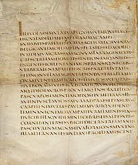
Before the 4th century CE, square capitals were used to write de luxe copies of the works of authors categorized as "pagan" by Christians, especially those of Virgil; the only three surviving manuscripts using this letter, among them the Vergilius Augusteus, contain works by Virgil. After the 5th century the square capitals fell out of use, except as a display lettering for titles and chapter headings in conjunction with various script hands for body text: for example, uncials.
Edward Catich is noted for the fullest development of the thesis that the inscribed Roman square capitals owed their form, including the serifs, wholly to the use of the flat brush, rather than to the exigencies of the chisel or other stone cutting tools. Although not universally accepted, the brushed-origin thesis had been proposed in the nineteenth century. Catich made a complete study and proposed a convincing ductus by which the forms were created, using a flat brush and then chisel.
Gallery
-
 The SPQR inscriptional capitals on the Arch of Titus, c. AD 81, are an example of inscriptional lettering which would have been infilled with bronze. Note the holes for the "tangs" of the cast bronze letters.
-
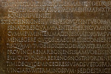
 Close-up of the Lyon Tablet, a bronze tablet from after AD 48
-
 Inscription from the turn of the 2nd and 3rd century AD
-
 Folio of the 4th century Vergilius Augusteus with handwritten square capitals
Later influence
Renaissance
Square capitals were greatly respected by artisans of the Renaissance such as Geoffroy Tory and Felice Feliciano.
Arts and Crafts movement
Main article: Trajan letteringIn the 19th and 20th centuries, they were a major inspiration for artisans of the Arts and Crafts movement such as Edward Johnston and Eric Gill, and so many signs and engravings created with an intentionally artistic design in the twentieth century are based on them.
Influence on modern typefaces
During the early era of the movable type printing press, Roman square capitals became the primary inspiration for the capital letters in early serif typefaces; Roman type, especially that developed by those associated with Aldus Manutius, came to produce a number of typefaces still used to the present day. The 1989 digital typeface Trajan from Adobe is a direct, all-capital adaptation of the Roman square capitals on Trajan's column.
See also
Notes
- Edward Catich promulgated his views in two works, Letters Redrawn from the Trajan Inscription in Rome and The Origin of the Serif: Brush Writing and Roman Letters.
- Often referred to simply as "Bringhurst", Robert Bringhurst's Elements is widely respected as the current English-language authority on typographic style.
References
- Warde, Beatrice (1926). "The 'Garamond' Types". The Fleuron: 131–179.
- Ivans, William M. (April 1920). "Geoffroy Tory". Bulletin of the Metropolitan Museum of Art. 15 (4): 79–86. doi:10.2307/3253359. JSTOR 3253359. Retrieved 17 September 2017.
- Nash, John. "In Defence of the Roman Letter" (PDF). Journal of the Edward Johnston Foundation. Retrieved 13 October 2016.
- Johnston, Edward (1906). Writing & Illuminating & Lettering. Macmillan. pp. 268–269, 384, 391.
The Roman capitals have held the supreme place among letters for readableness and beauty. They are the best forms for the grandest and most important inscriptions.
- Zhukov, Maxim. "The Trajan Letter in Russia and America". Typejournal.ru. Retrieved 4 March 2017.
- Mosley, James (1964). "Trajan Revived". Alphabet. 1: 17–48.
- Bringhurst, Robert (2008), The Elements of Typographic Style (version 3.2). Vancouver: Hartley & Marks.
- Riggs, Tamye (12 June 2014). "The Adobe Originals Silver Anniversary Story: Stone, Slimbach, and Twombly launch the first Originals".
| Latin script | |||||||||||||||||||||||||||||||||||||||||||||||||||||
|---|---|---|---|---|---|---|---|---|---|---|---|---|---|---|---|---|---|---|---|---|---|---|---|---|---|---|---|---|---|---|---|---|---|---|---|---|---|---|---|---|---|---|---|---|---|---|---|---|---|---|---|---|---|
| Alphabets (list) | |||||||||||||||||||||||||||||||||||||||||||||||||||||
| Letters (list) |
| ||||||||||||||||||||||||||||||||||||||||||||||||||||
| Multigraphs |
| ||||||||||||||||||||||||||||||||||||||||||||||||||||
| Keyboard layouts (list) | |||||||||||||||||||||||||||||||||||||||||||||||||||||
| Historical Standards | |||||||||||||||||||||||||||||||||||||||||||||||||||||
| Current Standards | |||||||||||||||||||||||||||||||||||||||||||||||||||||
| Lists | |||||||||||||||||||||||||||||||||||||||||||||||||||||