 The Korean War Memorial in Veterans Memorial Park, Auburn, New York, uses wonton font to imitate brush strokes.
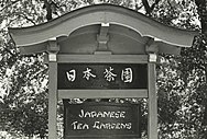
 An early use of a wonton font ("Japanese Tea Gardens") in signage for the World's Columbian Exposition, 1893.
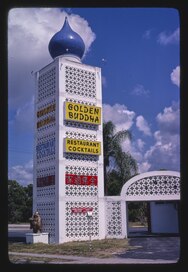
 Chinese restaurant in Florida with wonton font signage
A wonton font (also known as Chinese, chopstick, chop suey, or kung-fu) is a mimicry typeface with a visual style intended to express an East Asian, or more specifically, Chinese typographic sense of aestheticism.
Styled to mimic the brush strokes used in Chinese characters, wonton fonts often convey a sense of Orientalism. In modern times, they are sometimes viewed by those in the East Asian diaspora as culturally insensitive or offensive.
History
The first commercial typeface of this style was patented in 1883 by the Cleveland Type Foundry, under the name "Chinese", which became "Mandarin" in the 1950s. Many variations of this style of font have been created by typeface designers since its inception.
Controversy
Some Asian Americans find wonton fonts amusing or humorous, while others find them offensive, insulting, or racist. The font's usage is often criticized when paired with caricatures that recall the Yellow Peril images of the late 19th and early 20th centuries. In 2002, the American clothing retailer Abercrombie & Fitch faced controversy when it produced a series of T-shirts with buck-toothed images and wonton font slogans. The Chicago Cubs experienced backlash from the Asian American community after a similarly offensive T-shirt was produced by an independent clothing vendor in 2008. The questionable use of such fonts was the subject of a 2012 article in the Wall Street Journal by cultural commentator and journalist Jeff Yang. In 2018, the New Jersey Republican State Committee was criticized for sending out a political mailer describing Korean-American candidate Andy Kim as "real fishy" and printing his name in a wonton font.
See also
References
- ^ Quito, Anne (April 8, 2021). "Karate, Wonton, Chow Fun: The end of 'chop suey' fonts". CNN Style. Archived from the original on April 11, 2023. Retrieved April 14, 2023.
- ^ NERD, new experimental research in design : positions and perspectives. Michael Erlhoff, Wolfgang Jonas, Board of International Research in Design. Basel, Switzerland. 2018. ISBN 978-3-0356-1742-9. OCLC 1076409412.
{{cite book}}: CS1 maint: location missing publisher (link) CS1 maint: others (link) - Shaw, Paul (June 17, 2009). "Stereo Types". Print Magazine. Retrieved October 5, 2019.
- Fernández, Nichole (November 19, 2015). "StereoTYPES". It Ain't Necessarily So. Retrieved October 5, 2019.
- Strasburg, Jenny (April 19, 2002). "Abercrombie recalls T-shirts many found offensive". San Francisco Chronicle. Retrieved June 15, 2013.
- Wittenmyer, Gordon (April 18, 2008). "Fukudome doesn't find racist T-shirts in Wrigleyville funny". Chicago Sun-Times. Archived from the original on May 14, 2008. Retrieved August 21, 2013.
- Yang, Jeff (June 20, 2012). "Is Your Font Racist? - Speakeasy". The Wall Street Journal. Retrieved June 15, 2013.
- Alexander, Dan (September 19, 2018). "Racist font? NJ Republican leader defends anti-Kim mailer". NJ 101.5. Retrieved October 17, 2024.
- Quito, Anne (April 7, 2021). "Karate, Wonton, Chow Fun: The end of 'chop suey' fonts". CNN. Retrieved October 17, 2024.
- Willis, Jay (October 31, 2018). "Republican Candidates Sure do Love Sending Gross, Bigoted Mailers to Prospective Voters". GQ. Retrieved October 17, 2024.
External links
This article about ethnology is a stub. You can help Misplaced Pages by expanding it. |
This typography-related article is a stub. You can help Misplaced Pages by expanding it. |